Where to find appearance settings
Go to My Book Showroom → Settings and click the Appearance tab. A live preview mini-grid on the right side of the page updates as you change settings so you can see the effect before saving.
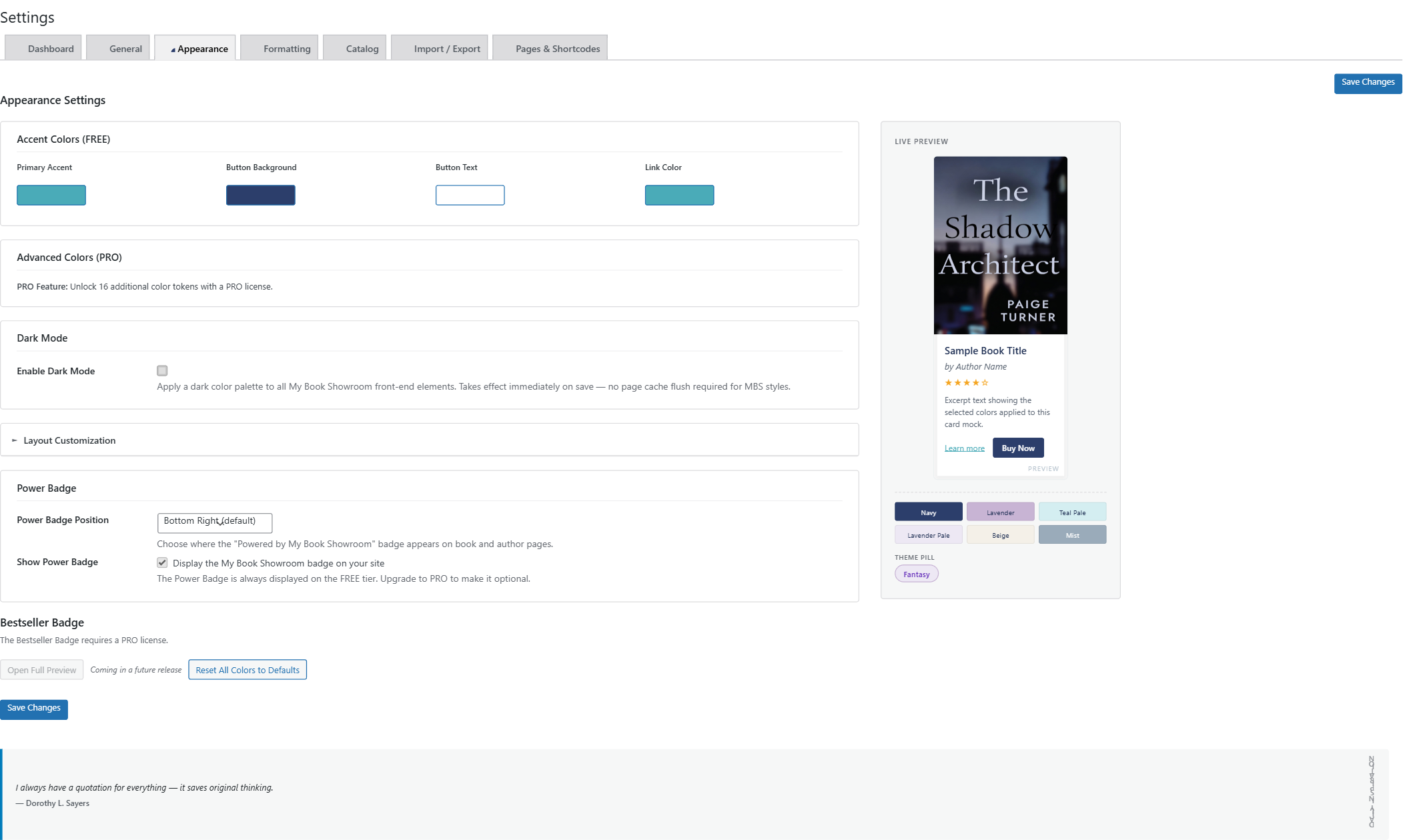
Accent Colors (FREE)
Four color tokens are included at no charge:
- Primary Accent — used for heading underlines, decorative highlights,
and other brand-color details throughout the showroom
- Button Background — the fill color for all buy buttons
- Button Text — the label color on buy buttons
- Link Color — the color of text links inside book sections
Click any color swatch to open the picker. You can choose visually or type a hex value directly.
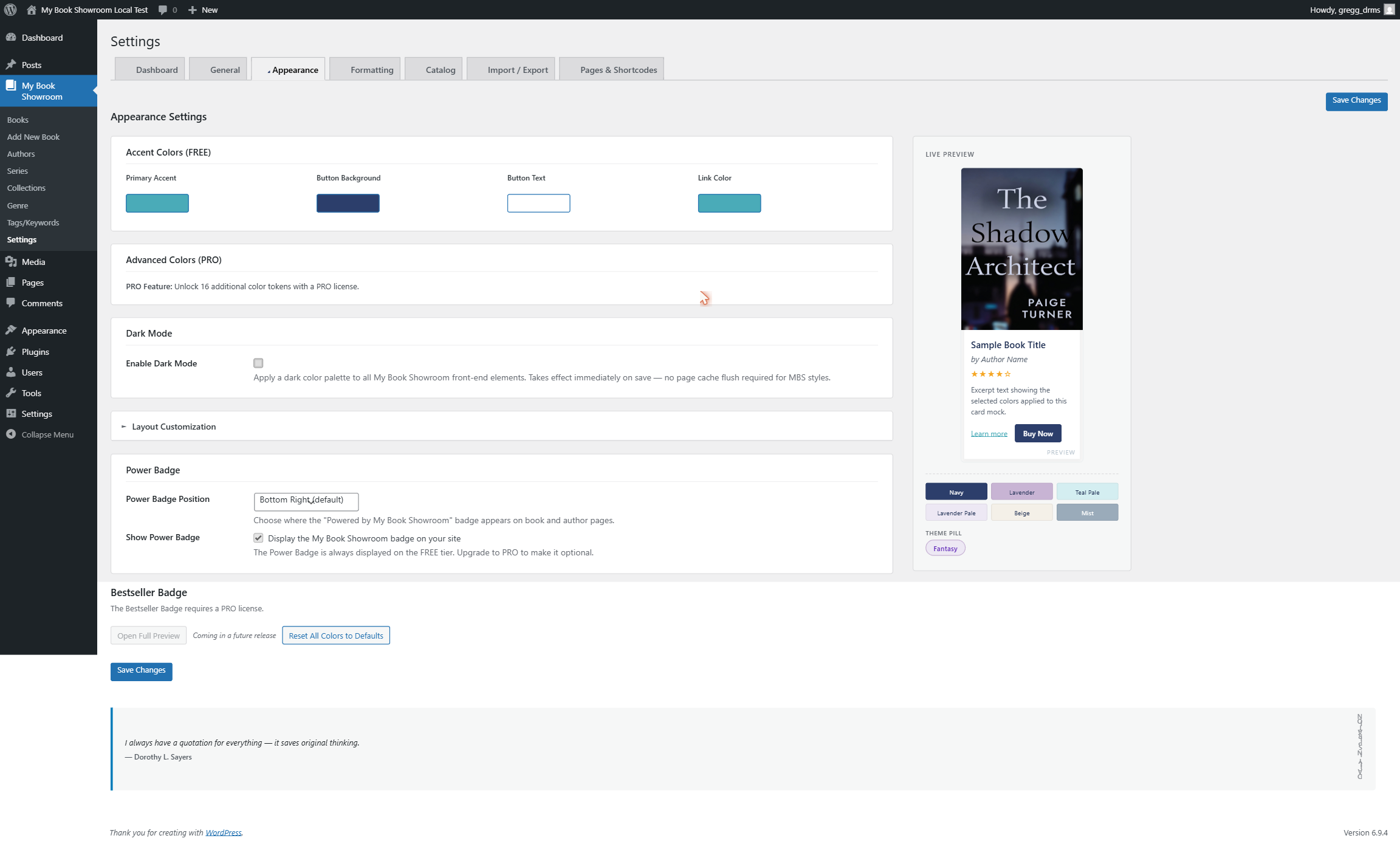
After choosing your colors click Save Changes.
Click Reset All Colors to Defaults at the bottom of the Appearance tab to restore all color tokens to the plugin defaults in one step.
Card spacing (FREE)
The Card Gap setting controls the space between book cards in grid and list layouts. Three named options are available (leaving the field at its placeholder uses the default spacing):
- Compact — tight spacing, fits more cards per row
- Comfortable — generous spacing, easier to visually scan
- Spacious — maximum spacing, ideal for large covers with copy below
Select an option, watch the live preview update, then click Save Changes.
Display layout (FREE & PRO)
The layout controls how your [mbs_showroom] shortcode renders books.
To change the default layout, go to Settings → Formatting (a separate tab from Appearance) and find the Default Layout thumbnail picker.
The FREE tier includes:
- Hero — large-card, cover-forward grid (the default)
- Grid — compact cover grid
- Card — card-style layout with text alongside covers
- Masonry — variable-height pinterest-style grid
- List — horizontal rows with cover and details side by side
PRO adds Slider, Flip, Filter, and Popup layouts.
The layout set here is the default. Individual [mbs_showroom] shortcodes can override it with the layout="" attribute, letting you use different layouts on different pages of your site.
Dark mode (FREE)
In the Appearance tab, find the Dark Mode section and check Enable Dark Mode to apply a dark color palette to all My Book Showroom front-end elements.
Leave the checkbox unchecked to keep the showroom in light mode.

Click Save Changes. The change takes effect immediately — no page cache flush is required for MBS styles.
PRO appearance additions
With a PRO license the Appearance tab gains:
- Column count — set the number of columns in grid layouts (1 through 6)
- Border radius — Square, Slight, or Rounded card corners
- Extended color palette — 16 additional color tokens for fine-grained
control over card backgrounds, border colors, section headers, and more