
What you will need
- My Book Showroom PRO license activated on your site
- At least one published
mbs_bookpost so you can see the layouts render - Access to My Book Showroom → Settings (Appearance and Formatting tabs)
Step 1 — Choose a default layout in Settings
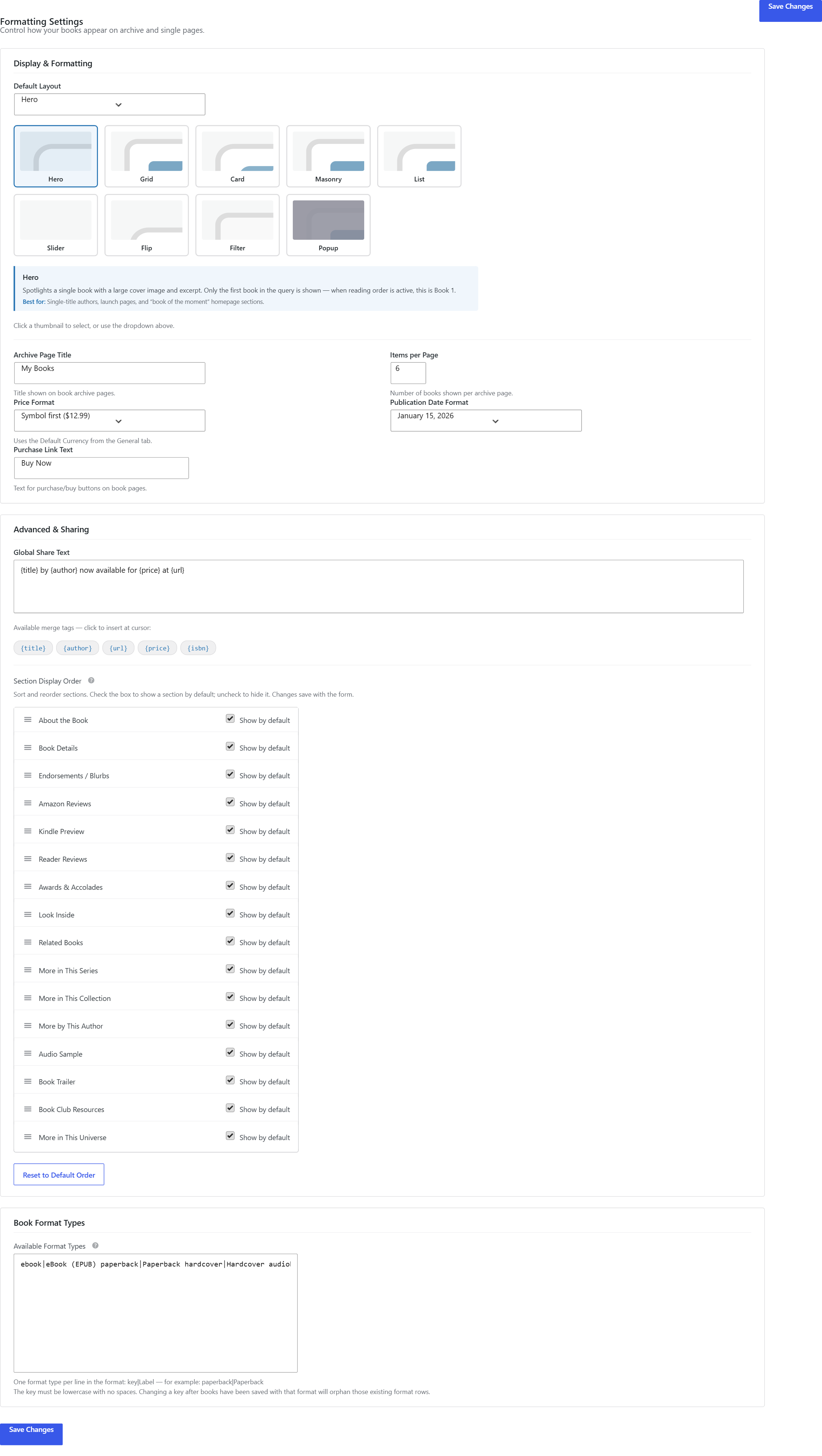
Open My Book Showroom → Settings and click the Formatting tab. You will see the Default Layout widget — a row of thumbnail cards, each showing a preview of the available layouts.
The five FREE layouts are always available: Hero, Grid, Card, Masonry, and List. With PRO active, four additional layout thumbnails appear:
| Layout | What it does | |---|---| | Slider | Horizontal scrolling carousel with prev/next arrows; cover-forward display | | Flip | Cards flip on hover to reveal the blurb and buy button on the back face | | Filter | Adds a live genre/tag filter bar above the grid; readers filter without a page reload | | Popup | Clicking a cover opens a lightbox with the full book card, blurb, and buy buttons |
Click the thumbnail for the layout you want as your site-wide default, then click Save Changes.
Step 2 — Configure column count and border radius
Switch to the Appearance tab in Settings. With PRO active, two additional controls are unlocked:
Column Count — a numeric input (1–6) that sets how many columns your showroom grid uses. The default is 4.
Border Radius — a three-option picker: Square, Slight, or Rounded. This applies to book cards across all layouts.
Adjust both controls to match your site design, then click Save Changes.
Step 3 — Extend your color palette
Still in the Appearance tab, scroll to the Color Tokens section. PRO unlocks 16 additional color tokens beyond the FREE set, including card background, card border, section header color, and per-element accent tokens.
Click any color swatch to open the picker, choose your color, and click Save Changes when done.
Use your theme's primary and secondary colors for the card background and border tokens — this makes the showroom feel like a native part of your site rather than an embedded widget.
Step 4 — Override the layout for a single shortcode
The global default applies everywhere you place [mbs_showroom]. To use a different layout on one specific page, add the layout attribute directly in the shortcode:
[mbs_showroom layout="slider"]
[mbs_showroom layout="filter" columns="4"]
[mbs_showroom layout="flip" columns="3"]
[mbs_showroom layout="popup"]
The columns attribute also works as a per-instance override and accepts any value from 1 to 6.
The layout attribute in the shortcode always takes precedence over the global Default Layout setting in Settings → Formatting. Other pages using [mbs_showroom] without a layout attribute continue to use the global default.
Step 5 — Enable pagination on any layout
All PRO layouts support pagination. Add show_pagination="true" to any shortcode instance:
[mbs_showroom layout="filter" columns="4" show_pagination="true"]With pagination enabled, MBS renders prev/next controls below the showroom and respects the Books Per Page value set in Settings → Formatting.
Step 6 — Configure Slider auto-play
When using the Slider layout, you can set an auto-play interval so the carousel advances automatically. Add the autoplay attribute with a value in milliseconds:
[mbs_showroom layout="slider" autoplay="4000"]A value of 4000 advances the slide every 4 seconds. Set autoplay="0" to disable auto-play and require manual navigation with the prev/next arrows.
Keep auto-play intervals at 3000 ms or longer — shorter intervals can feel distracting for readers browsing a large catalog.