
What you will need
- My Book Showroom PRO or Publisher license activated on your site
- Basic familiarity with CSS (property names, selectors, values)
- Your browser's developer tools (Inspector / DevTools) for identifying class names
Step 1 — Open the Custom CSS field
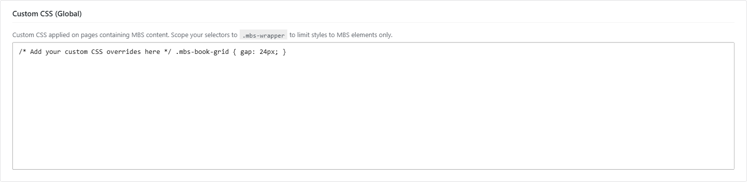
Go to My Book Showroom → Settings → Appearance and scroll to the bottom of the page. You will see a Custom CSS textarea.
Any CSS you enter here is stored in the mbs_setting_appearance_custom_css option and loaded as an inline <style> block on every front-end page where MBS renders content.
Step 2 — Understand the MBS scope wrapper
MBS wraps all showroom output in a single container with the class .mbs-showroom. Because of this, you can scope every rule you write to that class and your styles will not bleed into the rest of your theme.
/* Target only elements inside the MBS showroom */
.mbs-showroom {
  font-family: Georgia, serif;
}
Writing rules that begin with .mbs-showroom is strongly recommended. It prevents conflicts with your theme's global styles.
Step 3 — Use the Inspector to find the right class names
Before writing any CSS, open your showroom page in a browser tab, right-click the element you want to style, and choose Inspect (or Inspect Element). The DevTools panel will show you the exact HTML and class names MBS has applied.
MBS class names are stable between plugin versions. The most common selectors:
| Selector | What it targets | |---|---| | .mbs-showroom | The outer showroom container | | .mbs-book-card | An individual book card | | .mbs-book-card__cover | The cover image wrapper inside a card | | .mbs-book-card__title | The book title inside a card | | .mbs-buy-btn | The buy button on a card or book page | | .mbs-section-header | The heading above a genre or series group | | .mbs-book-page | The single book detail page container |
Inspect the element on the live showroom page, copy the class from the DevTools HTML panel, and paste it directly into your CSS. This eliminates guesswork.
Step 4 — Override CSS variables for global color changes
MBS uses CSS custom properties (variables) for all color tokens. Overriding a variable changes it everywhere MBS uses that color — no need to hunt down individual selectors.
Target :root or .mbs-showroom to set a variable:
/* Change the primary accent color site-wide */
:root {
  --mbs-primary-accent: #c0392b;
}

/* Or scope it to just the showroom */
.mbs-showroom {
  --mbs-btn-bg: #1a1a2e;
  --mbs-btn-text: #ffffff;
  --mbs-link-color: #c0392b;
}
The available color token variables include --mbs-primary-accent, --mbs-btn-bg, --mbs-btn-text, and --mbs-link-color, among others. Use your browser Inspector on any MBS element to see the full variable list applied to .mbs-showroom.
Step 5 — Write, save, and verify your CSS
Type or paste your CSS into the Custom CSS textarea in Settings → Appearance. Click Save Changes.
There is no live preview inside the settings page. To see the result, visit your showroom page in a new browser tab (or reload it).
MBS passes the Custom CSS field through WordPress's wp_strip_all_tags() for basic sanitization. Do not paste CSS from an untrusted source, as malformed or adversarial CSS could affect your site's appearance.
Work in small increments. Add a few rules, save, check the front end, then add more. It is much easier to identify which rule caused an unexpected layout shift when you add rules one at a time.
Step 6 — Example: restyling book cards
Here is a complete example that rounds the card corners, adds a subtle shadow, and changes the buy button color:
.mbs-showroom .mbs-book-card {
  border-radius: 8px;
  box-shadow: 0 2px 8px rgba(0, 0, 0, 0.12);
}

.mbs-showroom .mbs-book-card__cover {
  border-radius: 4px 4px 0 0;
}

.mbs-showroom .mbs-buy-btn {
  background-color: #2c3e50;
  color: #ffffff;
  border-radius: 4px;
}

.mbs-showroom .mbs-buy-btn:hover {
  background-color: #1a252f;
}
Save and visit your showroom page to see the updated cards.